—
Uniform-ity
—
What can you say about the unveiling of the new CU uniform combinations?
It could have been worse.
Perhaps it is a reflection of the state of Colorado football that simply having an event not turn out badly is a sign of progress.
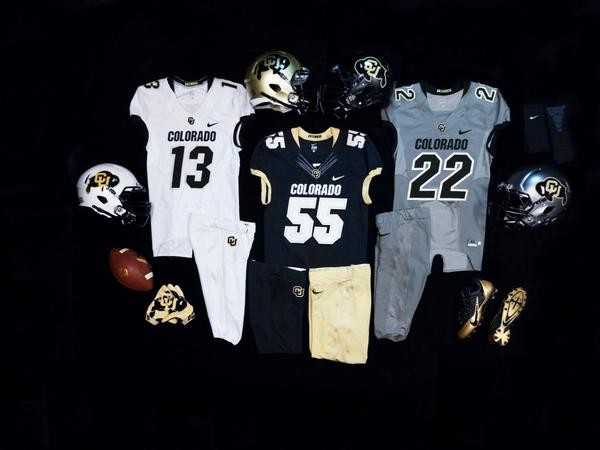
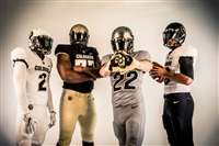
CU introduced its new uniform designs on Friday, with new helmets, uniform and pant options adding up to 48 different game day combinations. The event was forced indoors due to inclement weather, and the timing of the Folsom Frenzy (during the NFL draft, well after spring football, etc.) has been questioned (by me in “The (Re)Branding of CU” several weeks ago, and by Kyle Ringo of the Daily Camera in an article this weekend).
Still, even though there was rain on CU’s parade, the event was nonetheless a success.
First and foremost, the CU administration is to be commended for not going “all Oregon” in the design of the new uniforms. Tradition was a major component in the decision-making process.
“There are certain elements of the Colorado uniform that are very important, not only to us but to our fans, our former players”, said J.T. Galloway, an assistant athletic director for licensing/equipment who worked with head coach Mike MacIntyre and Nike officials before the Buffs signed off on their new looks. “The first thing we said was Colorado across the chest (of the jerseys) is a non-starter for us. That’s going to remain. We told them that there are too many times on television now when you turn it on you don’t know who’s playing. You can always turn on your television and know the Colorado Buffs are playing. And you’ll be able to continue to do that. We have taken what is a classic college football uniform and enhanced it, tweaked it ever-so-slightly.”
MacIntyre agreed: “I don’t think so (that fans will be upset) because of the Colorado (on the front of the jerseys) and the same Buffalo. We made it a little bigger so it would show up on from on the stands and on television, which I think is great.”
The color schemes turned out better than I had expected. It had long been rumored that grey/silver and white were to be included in the new uniform options, and I was skeptical. Other schools which have come out and played in grey uniforms have looked bland (Washington State comes to mind), while at the same time not doing anything to add to the school’s brand.
The new grey CU uniforms, though, look good to me (though perhaps grey-on-grey). The new color was referred to as a “steel” grey, which I like – it makes it sound tougher.
The white uniforms were a very pleasant surprise. CU has played in all white on the road many times, and – at least to me – the uniforms made the CU players look small – and by extension – weak. The “storm trooper” uniforms, though, I think look very cool.
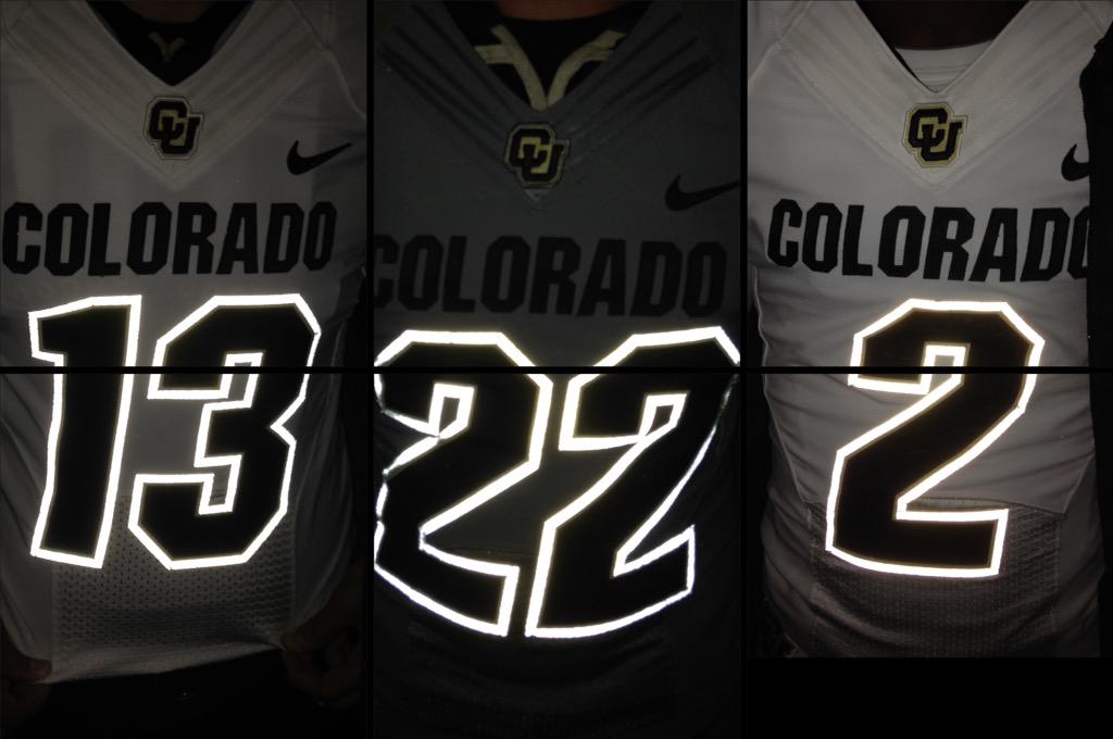
There are also subtle changes which are going to call attention to the Buffs when they play on television. Keeping the CU logo on the pant legs was a nice touch, as was having “Uncommon” sewn into the collars. But what will bring about comments during CU night games will be the “glow in the dark” aspect of the uniforms.
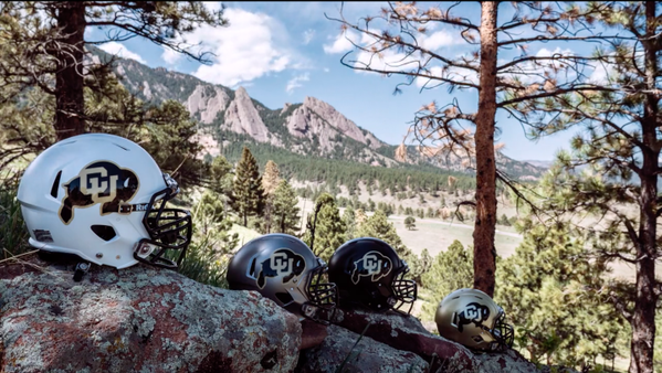
The best part of the new uniforms, though, are the helmets. There was an opportunity to make a mess of this, but instead CU did a great job. I was especially concerned about the white helmets, but those might turn out to be the best of the bunch. The grey – excuse me – steel helmets are also very impressive (one suggestion … with gold as one of CU’s colors, why wasn’t a gold chrome helmet considered as a viable alternative?).
How will the new uniform combinations be utilized? With 48 different options, CU could play almost four full seasons without repeating a uniform style. Is that the plan? “Realistically, it won’t be 48,” said Galloway. “There are some (combinations) that I’m not sure ‘flow’ from head to toe. (The total) is going to be a little bit south of 48.”
What the Buffs will be wearing when and where, said MacIntyre, will be decided in July in a meeting of the captains and seniors. “We’ll plan out the whole season then,” he said, “all the different combinations we’ll do and kind of match it against what other teams might wear.”
The Buffs are not above trying for a little extra motivation come November, should the need arise. “There has been talk about a certain combination or two for the end of the year if we need that extra oomph,” said Galloway. “Yes, absolutely.”
Having lived through the “deep blue Colorado of Colorado’s sky at 9,000 feet” era, these new uniform style are a great addition to the CU arsenal.
In 1985, the “Black is Back” campaign dropped the baby blue (excuse me, “Colorado sky blue”) uniforms of the past four seasons. The Buffs then promptly went from a 1-10 team in 1984 to a 7-5 bowl team in 1985.
The announcement that CU was going back to its black uniform came on April 24, 1985. Almost exactly thirty years later, another uniform change was announced.
Let’s hope for a similar turnaround on the field will be coming this fall ….
——
4 Replies to “Uniform-ity”
The steel is solid… Have we ever won a game in white jerseys and pants? It seems like we always get trucked in that combo
They look great! The numbers and lettering style are like the Barnett-era uniforms which I really like. Also nice to see silver brought in, especially the helmet, seeing as how it’s an official school color and all.
I am really not sure about the white helmets, but I like the steel.
Love the néw uniforms….classy but still traditional…..and great colors. Should be great on the field and the details will show on the field! Good job! Go Buffs!